From Beer Mug to Brand Icon: A Fresh Start for this Local Bar
Friendly Bob's is a favorite local bar and restaurant.
For years, the Friendly Bob’s logo did its job...technically.
Two beer mugs. A bold font. A look you’d see on several other doors down the street.

And that was the problem.
In an industry built on atmosphere, personality, and memory, blending in is the fastest way to be forgotten. Poof!!
The Problem with the Generic Beer Mug
Beer mug logos are popular for a reason, they instantly communicate bar.
But they also communicate:
-
Interchangeability
-
Low memorability
-
No emotional hook
If every bar looks the same, customers choose based on convenience, not connection. And connection is what turns first-time visitors into regulars.
This bar needed more than recognition. This redesign was about giving the bar a face, a voice, and a presence.
It needed identity.
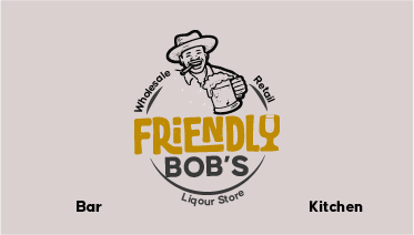
The Strategic Shift: From Symbol to Character
Instead of another abstract icon a custom character mark was introduced. A visual personality inspired by the bar’s energy, clientele, and local culture.
Why a character?
Because characters do what objects can’t:
-
They tell stories
-
They express attitude
-
They create emotional familiarity
This wasn’t a cartoon for novelty’s sake. It was a carefully designed brand ambassador. Someone you’d expect to meet inside the bar.

Modernizing Without Losing the Soul
One of the biggest risks in redesigns is losing authenticity in the pursuit of being modern. This redesign avoided that by focusing on refinement, not replacement.
What changed:
-
A scalable logo
-
A Unique design that work across signage, menus, and social media
-
A color palette with stronger contrast
The business' attitude, along with its fun and welcoming atmosphere can still be felt.
Friendly Bob's new logo feels contemporary and timeless. Something that will still look intentional for years from now.

The Bigger Picture: Branding as Experience
This redesign was about realignment.
The new logo now supports:
-
A stronger social media presence
-
Consistent interior and exterior branding
-
Event promotions with personality
-
Merchandise that people actually want to wear
Most importantly, it intentionally positions Friendly Bob's, not by default.
Final Thoughts
A logo redesign isn’t about erasing the past.
It’s about refining the future.
By moving from a generic beer mug to a custom character mark, this bar didn’t lose its identity, it finally found it.
In a crowded nightlife scene, that difference is everything.